The Trick Copy on These Clever Ads Shows Another Side to Homelessness

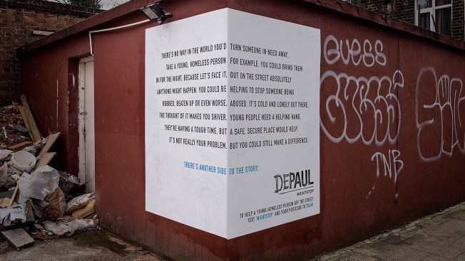
Here’s a clever outdoor campaign from Publicis London for the homelessness charity Depaul that manages to tell two different stories with the same copy.

The ads are being placed on corners, with text on each side. If you read only the left side, the copy is all about the negative ideas people have about giving up a spare room to a homeless youth. But reading them in full, the ads actually argue for the benefits of volunteering.

“There’s another side to the story,” says the tagline.

Click the images below to enlarge.

Conceptually, the campaign is quite similar to BBDO New York’s award-winning ads for BBC America back in 2007. Those ads, also placed around corners, showed two sides of the same photo, with the tagline: “See both sides of the story.”

The clever use of text differentiates this new effort, though it will always be likened to the BBC work. See more from the campaign, plus credits, below.

CREDITS
Client: Depaul
Agency: Publicis London
Executive Creative Director: Andy Bird
Creative Director: Paul Mason
Art Director: Dan Kennard
Copywriter: Ben Smith
Head of Art and Design: Andy Breese
Designer: Dave Stansfield
Photographer: Mark Wesley
Account Manager: Tom Froggett
Head of Operations: Debbie Burke
Agency Producers: Steve McFarlane, Ed Page, Greg Collier
Art Buyers: Sarah Clifford, Claire Lillis


Homeless People Read Mean Tweets in This Heartbreaking PSA

People reading mean tweets is turning into a PSA genre.

Last month, the Canadian Safe School Network took Jimmy Kimmel’s hit comedy bit, usually featuring celebrities, and repurposed it as a potent anti-cyberbullying ad. Now, Raising the Roof Canada has upped the ante even further with a stunning and heartbreaking spot about the homeless.

In a perfect world, it would be hard to imagine anyone seriously saying (or typing) the things repeated in the clip. But once again Twitter proves its brief format is the perfect platform for bad wannabe comics and self-absorbed asses (whereas Instagram is the favored choice of glib, blithe fashion editors).

The clip is all the more powerful given that, compared to an in-vogue issue like cyberbullying, homelessness is less visible (at least, online). This ad, created by Leo Burnett Toronto, simply put, succeeds in humanizing the homeless population, and gives at least a small handful of its members a bigger platform. For anyone interested, the campaign website has more videos delving deeper into each person’s reaction, as well as some of their backstories.

Luckily, Twitter, as a company, is doing its part to address the broader issue in San Francisco, too—by planning to teach the homeless to code as part of a tax break obligation.


This Art Director Beautifully Redesigns Homeless People's Signs

America’s homeless face myriad challenges, from mental illness to problems with addiction and substance abuse to amateur typography. The last of those is something that a Chicago art director is trying to address through a project called The Urban Type Experiment.

“As an art director it’s my job to grab people’s attention with great design every day. So I set out to see if great design could have an impact on people in the most ignored platform,” the site says.

Basically, the art director makes the acquaintance of a new homeless person every week, re-letters his or her signage, then checks back to see if the efforts helped at all. The site is pretty honest about how helpful the work has or hasn’t been, which makes it seem less like a roundabout self-promotion tactic and more like genuine outreach.

See more of the work below. Via Design Taxi.


Next Up in Useful Outdoor Ads: Billboards That House the Homeless?

Outdoor ads have been physically demonstrating a commitment to environmental causes for a while. Here’s a project that aims to make a difference in a social issue.

Design Develop, an architectural design firm in Slovakia, has embarked on The Gregory Project, an initiative to turn billboard spaces into actual living spaces for the homeless.

Roadside boards in that country feature two surfaces that face oncoming drivers in both directions—creating a triangular space in between. The Gregory Project would build small two-room apartments in those spaces—one room with an entrance hall, kitchen with a small desk and a raised bed with storage underneath, and the other room being a bathroom.

The ad space would help offset the cost of construction, and the houses would already be wired for electricity because of the lights that illuminate the boards at night.

It’s a great idea to optimize existing structures, especially when you consider the additions wouldn’t infringe on the billboard. See more about the project here, including blueprints for the apartments. More images below.

Via PSFK.


Fashion Mannequins Fall on Hard Times in Homeless Advocacy Campaign

Mannequins usually symbolize the consumer ideal of the “good life,” draped in couture and jewelry in department-store window displays. But now they’ve fallen on hard times in a JWT stunt meant to raise money for Amsterdam’s growing homeless population.

Agency staffers rounded up unused mannequins, dressed them in ragged clothes and placed them around the city with cardboard signs asking for money. Each mannequin also had a piggy-bank-style donation slot cut into its head, and donations went to advocacy group BADT.

Critics might suggest that using “dummies” somehow demeans or trivializes the homeless, but I think it powerfully underscores just how dehumanizing it can be to live on the streets.

Produced in a week on a budget of less than 100 Euros, the effort seems to have yielded a good number of donations and, more importantly, attention for the issue. 

Still, I wonder how many passed the mannequins by with barely a glance? And how often do we ignore flesh-and-blood human beings, shivering beneath rags and huddled in doorways? Sadly, such sights are so common, they can fail to move us, or else they simply don’t register anymore.

Homelessness dehumanizes us all. Even those of us who have homes.

Via Ads of the World.


Would You Recognize a Loved One Dressed Like the Homeless? These People Didn’t

Most city dwellers tend to avoid eye contact with the homeless, a fact that made one advocacy group wonder: Would you recognize your own relatives if they were living on the street?

New York City Rescue Mission partnered with agency Silver + Partner for a hidden-camera stunt that filmed people as they walked past loved ones dressed to look homeless. Later, the passersby were shown video footage of themselves walking past their relatives without a second glance. 

As you'd probably expect, no one recognized their family members. One woman even walked right past her mom, uncle and aunt.

The stunt doesn't lead to any emotional breakdowns or similar histrionics, which is somewhat refreshing at a time when "gotcha" videos focus so hard on over-the-top reactions and immediate life-changing self-reflection. But the unwitting participants clearly feel ashamed of their oversight. 

Director Jun Diaz from production house Smuggler tells Fast Company that one person who was filmed asked not to be included in the final video "because they couldn’t handle the fact that they walked by their family."

On a related website, MakeThemVisible.com, the rescue mission further humanizes the needy by sharing photographs of real homeless New Yorkers, smiling while sharing their personal passions and hobbies.


How Do You Break Through Apathy? One Agency Tries for Rage

Pleas to help the poor are usually ignored. So what if you turned things around and started advocating against the poor? Would anyone come to their defense?

Publicis London put that question to the test with an experiment for The Pilion Trust. The agency stuck a guy with a "FUCK THE POOR" sandwich board on a busy London street and filmed people telling him off.

After plenty of heated reactions, including a police officer telling him "that's offensive" and a near fight with a homeless man, the organizers flipped the sign around to say "HELP THE POOR" in the same font, same presentation, and filmed everyone ignoring him. The resulting film has already gone viral, with over 1.2 million views in three days.

It's an interesting experiment, but does it really prove that people care about the poor? It seems more like it proves that people enjoy being self-righteous on topics where they know most people agree with them. The truth is, it doesn't cost anything to be offended.

I'd like to see if those people who got upset really did care enough to give. Publicis should design another experiment with two guys, one with a "help the poor" just down the street from the "fuck the poor" guy. Then we'll see how many people who yelled at one actually donated to the other.

CREDITS

Client: The Pilion Trust
Advertising Agency: Publicis, London
Director: Jonathan Pearson
Creative Director: Andy Bird
Art Director: Jolyon Finch
Copywriter: Steve Moss
Producer: Adam Dolman
Director of Photography: Peter Bathurst
Agency Producers: Sam Holmes, Colin Hickson
Editor: Toby Conway Hughes at Marshall Street
Postproduction: Absolute
Sound Design: Wave
Typographer: Andy Breese


Could the Homeless Boost ROI With Sexier, Snazzier, Professionally Designed Signs?

There's an old legend in advertising that goes like this: David Ogilvy was walking past a homeless man one day whose sign read: "I'm blind, please help." His cup was empty. Instead of giving him money, Ogilvy rewrote the sign to read: "I am blind, and it's spring." The cup soon overflowed with cash. Tada—a lesson in the power of storytelling.

Of course, stories that work in legend don't always work in reality, or so it seems when you try to apply the tricks of modern advertising to today's homeless signs. Writing team the Bilderbergers and director Ben Weinstein created a fictional project called Better Homeless Signs, bringing more compelling copy and design techniques to the traditional cardboard placard. Witness the sexy homeless sign, the meme-based homeless sign, and the prototype edible homeless sign (that's gotta be up for an award).

Of course, some real graphic designers have been doing this in an earnest manner since 2012. The way advertising is today, who knows how they afford the overhead. The takeout costs alone must be legendary. Full credits here.


Man Strikes Back at Abercrombie & Fitch by Giving Its Clothes to the Homeless

It's fairly well established that Abercrombie & Fitch doesn't want the wrong sort of people wearing its clothes. A couple of years back, it even offered (as part of a goofy PR stunt) to pay Jersey Shore star Mike "The Situation" Sorrentino to stop buying its apparel, saying his implicit endorsement "could cause significant damage to our image." Now, the clothier is getting heat for its supposedly exclusionary marketing policies once again—this time based on a 7-year-old quote from CEO Mike Jeffries. In the quote—dredged up in the wake of similar criticisms levied at A&F in a new book—Jeffries says, "In every school there are the cool and popular kids, and then there are the not-so-cool kids. Candidly, we go after the cool kids." That incensed a guy named Greg Karber, who decided to try to piss Jeffries off by giving A&F clothes to the most uncool kids he could find—homeless people. Despite Karber's best intentions, his video of the stunt comes off as forced and, in a way, exploitative itself, as he's simply using the homeless as a tool to trash the brand. (The charity aspect is clearly incidental.) But the video, posted Monday, is quickly closing in on a million views, proving yet again that hating on Abercrombie is a pastime most people can get behind.