Cosmo Designed a Car for Women, and That's Going Over About as Well as You'd Expect

Women everywhere, rejoice! There is now a car just for us!

Women’s magazine and marketing menace Cosmopolitan announced at London Fashion Week that it’s teamed up with car maker Seat to release a vehicle designed for “fun and fearless Cosmo girls.”

read more

This Newspaper Turned Its Front and Back Pages Into an Anti-Violence Protest Sign

Have you ever heard what people say about Latinos? They’re intense, passionate and “macho”—a quality that’s often seen as protective.

Obviously, these are stereotypes. Another side of the “Latin man” is that he can be sensitive and expressive. But embracing “machismo” for its good qualities, without examining the bad stuff, can have unpleasant cultural side effects—like controlling behavior, which can lead to femicide, not to mention relatively unpunished rape. 

(Hey. Sounds familiar.)

To show its support ahead of an Aug. 13 protest in Peru, Grupo el Comercio-owned newspaper Peru 21, one of the most popular papers in the country, tossed its cover pages into the ring. With help from McCann Lima, the paper converted its front and back pages into signs that protesters could grab off newsstands, flip open and carry in the streets. 

read more

Some Very Ugly Fish Star in This Bizarre Ad About Investigative Journalism

The news is like the ocean. On the surface, everything might seem pretty, but the further down you go, the worse things look. 

That, at least, is the metaphor behind a new ad from Veja, a popular right-leaning (if not right-wing) Brazilian magazine that featured President Obama as Che Guevara on its cover in 2014. 

read more

This Newspaper Used an Algorithm to Play a Nasty Trick on Readers in Comments Section

A publication in Pakistan is taking an aggressive approach to stressing the importance of press freedoms—by helping readers better understand the unpleasantness of having their own words inverted.

read more

Time Turned the Year's Hottest Tech Into the Year's Dumbest Cover, and Parody is Rampant

OculusVR founder Palmer Luckey is one of the tech industry’s brightest rising stars—a fact Time tried but ridiculously failed to capture on its newest cover.

As you can see above, Luckey is shown in mid … uh, jump? Stumble? Rapturous epiphany? The only things viewers can tell for sure is that he’s been Photoshopped in front of a beach and that he looks ridiculous.

And it’s not just the image drawing heckles from tech enthusiasts. The story’s intro is cringe-inducingly awful at a time when most people have stopped seeing nerds as socially worthless outcasts:

“Palmer Luckey isn’t like other Silicon Valley nerds,” the article begins. “He’s a nerd all right, but not the kind who went to a top-ranked university, wrote brilliant code or studied business plans. He’s cheery and talks in normal sentences that are easy to understand.”

It’s doubtful that all this is just artful baiting of the Reddit crowd, but had it been, the results would likely have been the same. Photoshop has been working overtime today as many took up the challenge to make Luckey (and Time) look even more silly:

But perhaps this un-Photoshopped take was the cruelest cut of all:

Amy Schumer Narrates the Extremely Awkward Experience of Her Glamour Cover Shoot

Glamour is getting good at video content tied to its cover models and other interviewees. A couple of months ago, we got Anna Kendrick’s take on Reddit’s Shower Thoughts. And in the weeks since then, the magazine has rolled out amusing clips featuring everyone from Kim Kardashian to Kendall and Kylie Jenner to Bella Thorne.

Now, it’s Amy Schumer’s turn.Glamour’s August cover star has narrated her inner thoughts as she was subjected to a humiliating cover shoot at Chelsea Piers. And it’s vintage Amy. As she puts it: “I love strangers touching me and taking pictures of me.”

Check out an excerpt from her magazine interview here. At one point she addresses her quip from the Glamour U.K. Women of the Year Awards, when she said, “I’m probably like 160 pounds right now, and I can catch a dick whenever I want.”

“If a guy was like, ‘I can get pussy whenever I want,’ that guy would be a dickhead,” she says. “But to deny that there’s a major difference is ridiculous. For women, we’re taught to eat less until we disappear. And trained to believe that if you don’t look like everyone else, then you’re unlovable. And men are not trained that way. Men can look like whatever and still date a supermodel. I’m proud of what I said. I think it’s good to see somebody saying: I have a belly. And I have cellulite. And I still deserve love. And to catch the old D. And to not apologize.”

Check out the photos from the shoot below:

Rolling Stone Wants the Whole World to Think, and Dress, Just Like Steve Jobs

In this amusing 90-second spot for Rolling Stone, men and women of all sorts dress up like Apple’s late co-founder Steve Jobs. They don wire-rim specs, black turtlenecks and blue jeans as they question aspects of their lives, large and small, ranging from health regimens and toupees to technology’s impact on the future.

The patently absurd sight of a geeky Steve army marching down the street is like an image plucked from Bill Gates’ darkest dreams. (Heck, it’s enough to give anyone nightmares!)

Produced in English and Spanish by The Community, the ad targets young adults in Argentina, encouraging them to “Question Everything” and find ways of improving their situations. It closes by showing a 2011 Rolling Stone cover: “The Steve Jobs Nobody Knew.”

The visuals here are pretty memorable, but the concept feels like a stretch, and doesn’t tie back to the magazine as well as it should. (The Community’s recent Corona spot, with winter narrating mournful letters to summer, is equally offbeat but more on brand.)

Mostly, “The Steves” reinforces Jobs’ standing as an icon of the highest magnitude. Ironically, that’s a distinction Rolling Stone itself once enjoyed, and the magazine’s effort to piggyback on the tech pioneer’s lasting relevance speaks volumes about our changing cultural landscape.

CREDITS
Client: Rolling Stone
Agency: The Community
Chief Creative Officer: Joaquin Molla / Jose Molla
Executive Creative Officer: Ramiro Raposo, Fernando Sosa
Art Director: Fernando Zagales
Copywriter: Juan Mesz
Group Account Director: Sebastian Diaz
Executive Account: Lucas Saez
Audiovisual Producer: Matias Castro
Responsible for the Client: Branowski Bárbara, Paula Rottenbücher
Production Company: Barry Company
Director: Mariana Youssef
Director of Photography: Adolpho Veloso
Director 1st Assistant: Elton Takii
Art Director: Guilherme Marini
Production Director: Tadeu Piantino
Wardrobe: Heloisa Cobra
Account Manager: Juliana Martellotta
Executive Producer: Krysse Mello
Editor: Alexandre Boechat / Rodolpho Ponzio
Postproduction: Fulano Filmes
Postproduction Coordinator: Karina Vallesi
Postproduction Supervisor: Ale Cois
Postproduction Supervisor Assistant: Sabrina Comar
Sound: Animal
Music Production: André Caccia Bava


This Foot-Care Brand Made the First Magazine You Read With Your Feet

What better way to sell foot-care products than with an entire magazine for and about feet?

Hansaplast, a Beiersdorf-owned band-aid brand, is launching a line of creams, deodorant and antiperspirant called FootExpert. To promote the products, agency Being created Feet Mag, a luxury publication designed with heavy paper that can be easily turned by one’s feet, and large print that you can enjoy from an eye-to-foot distance (for those unable to lift the book close to their faces using only their toes).

The magazine is packed with foot-themed stories about art (by the likes of Renoir, Gauguin, Delacroix and Manet) and fashion, with sassy pictures of women playing cards and blowing kisses with their own feet. There are even foot horoscopes (with advice like putting on rubber boots to prepare for the coming storm).

Check out a copy of the magazine here. (PDF link)

It’s a fun way to draw attention to a decidedly dull subject, certainly more noteworthy than buying ads in a well-established beauty magazine. But it doesn’t seem right to make your feet do all that extra work—even in the name of leisure.

Via PSFK.


Daily Mail Used a Steak House's Photo to Illustrate a (Probably Fake) Story on Cannibalism

Sure, it can be hard to find a good photo to illustrate an article about cannibalism, but that’s really no excuse for trying to pass off a restaurant’s steak as man-meat.

The owner of London’s Hawksmoor steak house understandably took issue with British tabloid The Daily Mail using a photo of his (quite lovely) chateaubriand to illustrate a story about a supposed restaurant serving human meat in Nigeria.

Snopes has cast doubts on the cannibalism story’s validity, and The Daily Mail today removed the article.

As for Hawksmoor owner Will Beckett, he seems to be taking the fiasco in stride. He sent a statement to several news outlets noting: “For clarity’s sake we don’t serve human flesh, there are no severed heads in our kitchen, and we’ve never even been nominated for ‘Nigeria’s Best Restaurant’ or ‘Cannibal Menu of the Year’.”


Anna Kendrick Will Gently Blow Your Mind With Her Take on Reddit's 'Shower Thoughts'

Glamour magazine isn’t known for it’s Internet-savvy marketing. But when you put Anna Kendrick on the cover, you have to do something special to celebrate the occasion.

So, they had the Pitch Perfect 2 star recite some of Reddit’s “Shower Thoughts,” which are pretty much the same as SNL’s old “Deep Thoughts” by Jack Handey—but on the Internet. Anna even throws a few of her own in there. Simple, smart and effective.

If you’re familiar with “Shower Thoughts,” you will have heard most of these before, but somehow the magic of Kendrick, an advertising darling who hasn’t had a miss with a campaign, elevates those old lines into true stoner mind-blowing territory. (Not that it’s exactly groundbreaking—you can, after all, also watch Cookie Monster’s “Shower Thoughts” for The Watercooler or Nick Offerman’s “Shower Thoughts” for Mashable.)

After just one day, it’s already one of the most popular videos on Glamour’s YouTube. Peep at all the other videos on the channel, and you’ll see this is really out of character for them. But it’s perfect for the Internet.


Here's the Most Fascinating Slide From BuzzFeed's 2008 Pitch to Investors

Back in 2008, BuzzFeed was a two-person editorial operation with 750,000 monthly visitors, but it already knew exactly where it was headed.

It was, at the time, just a sliver of what the media empire would become (it now boasts more than 200 million uniques and almost a billion video views a month). Still, site founder Jonah Peretti was confident in his business model and wanted to sell investors on his vision.

Looking back through the presentation (resurrected this week via a tweet from former New York Times digital exec Martin Nisenholtz and picked up by Quartz), you won’t find too many surprises—and that’s probably what’s most impressive. The deck shows BuzzFeed largely maintained its trajectory, building a sprawling juggernaut atop its early vision of “advertising as content” and “trend targeting.”

Most fascinating is the Venn diagram above, in which BuzzFeed attempted to visualize its role as the cross-section between digital advertising and popular content. The site vowed to be the best of both worlds, tapping the real-time zeitgeist similar to early competitors like Digg, but doing so in a way that created content worth selling ads against (or into). 

Sure enough, looking at that list of competitors is a keen reminder of just how dominant BuzzFeed has become. Mahalo has drifted off the cultural radar, while Squidoo was absorbed into HubPages. Reddit, of course, has been no slouch, but the real surprise in this chart is the unquestionable success of the hybrid content-marketing model BuzzFeed is laying out, a model that’s almost become a cliche of modern media amid the explosion of native advertising.

Of course, this hybrid model has created headaches for BuzzFeed along the way, most recently with the debate around the removal of articles that criticized ad partners. Check out more of the slides below, or view the full presentation on Scribd.


Apple Watch Gets Its First Advertising With a Stylish 12-Page Spread in Vogue

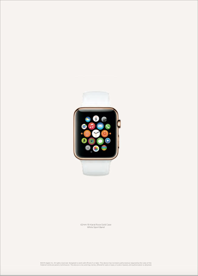
Apple Watch gets a 12-page spread in the March issue of Vogue, part of the run-up to the wearable device’s launch in April. Rate-card value: north of $2.2 million.

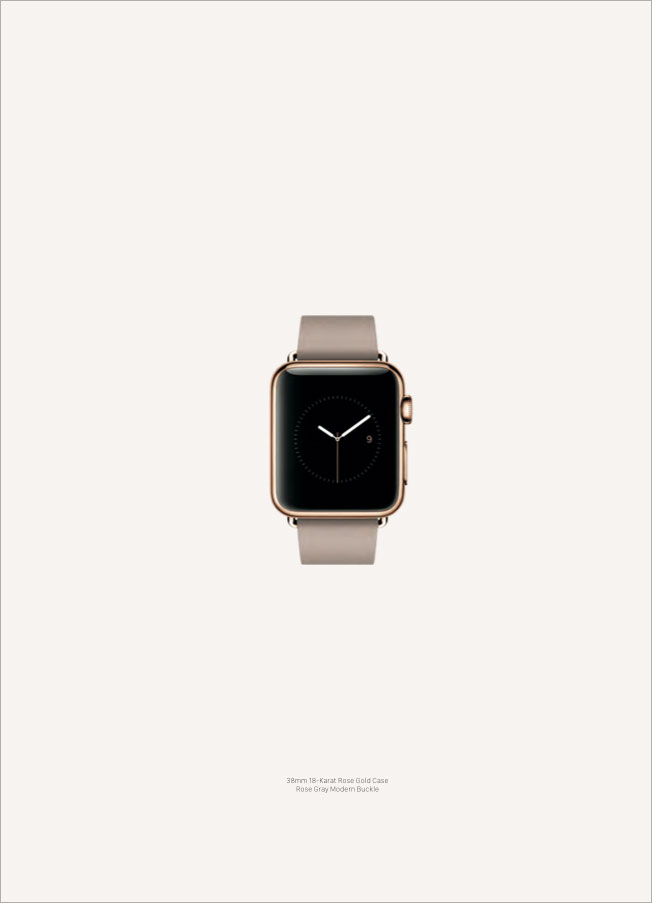
All three versions of the watch—the luxe 18-karat gold model, a sports watch and the leather-bound standard edition—are featured in the magazine’s “Spring Fashion Blockbuster,” and the images we’ve seen so far look appropriately stylish. (Scroll down to see for a sample of pages from the ad section.)

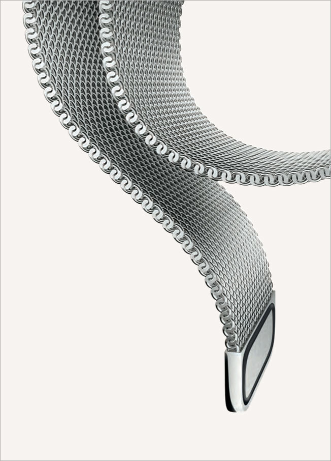
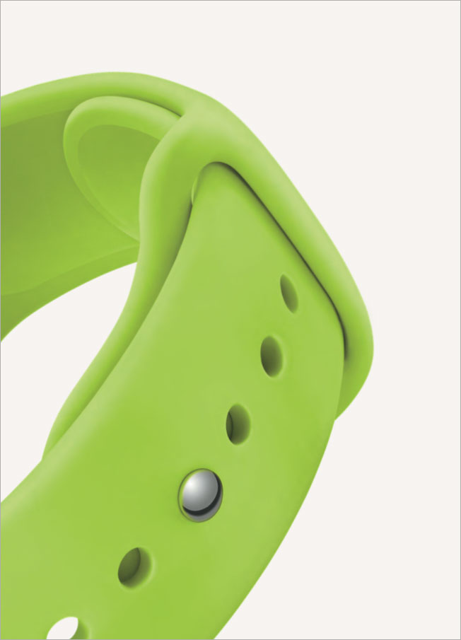
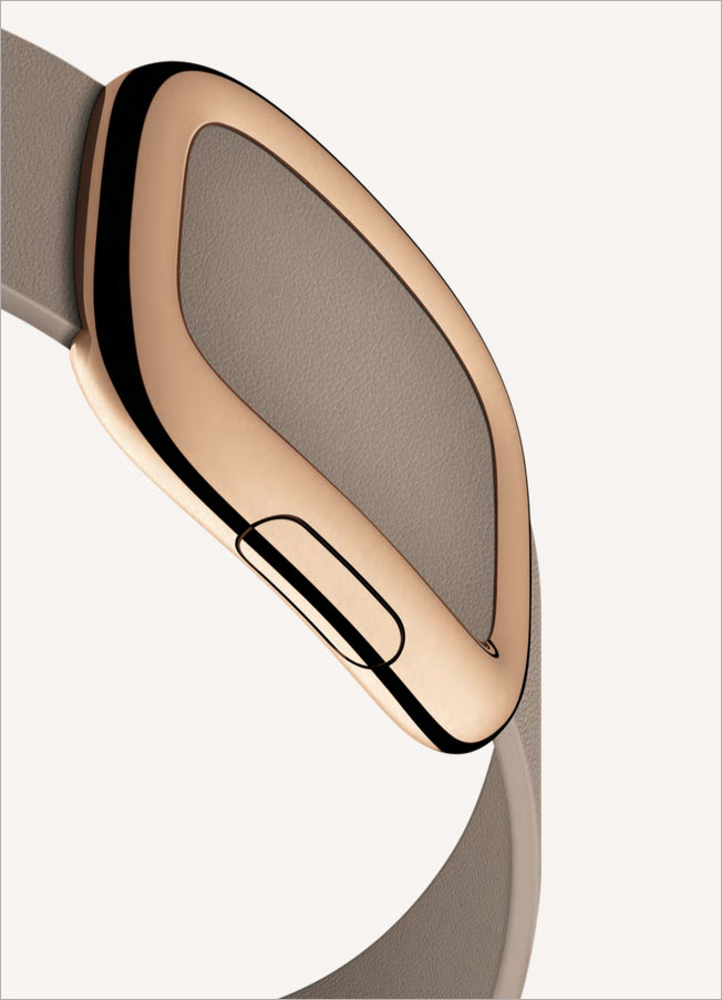
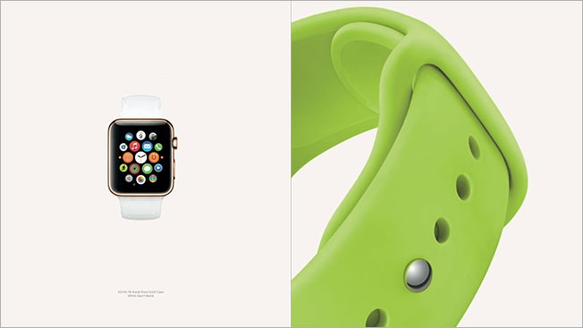
The sleek, angular devices are tastefully displayed in classic Apple style against plain white backgrounds. In one shot, the watch’s face appears to rise from a milky mist, the muted hues of its app icons signaling its time has arrived. Another shows a rising segment of the band in stark relief, suggesting a silvery stairway to heaven (by which I mean the nearest Apple Store, naturally).

More than anything, these arty abstractions resemble jewelry advertising, with the Apple Watch cast as the latest shiny bauble for the tech-crazed masses. Tres chic! Tres Apple!

Observers have generally lauded the strategy of positioning the watch as a fashion accessory, though some point out that Google Glass went the Vogue route with a spread two years ago and failed to catch on with the masses.

In my view, that’s an unfair comparison. The failure of Google Glass has been analyzed to death, but ultimately, its lack of “cool”—perched on users’ faces, for everyone to see—was perhaps a fatal, if unavoidable, flaw.

Apple Watch, a far more discreet wearable, won’t provide such a sorry spectacle. Like fine timepieces of old, it’s designed to be admired while remaining unobtrusive. Folks who catch a glimpse of the gadget won’t confer Glasshole-type scorn on wearers. Instead, the device will inspire curiosity and a desire to buy.

It will be in vogue in for years. Just watch.


SI's Swimsuit Models Look a Bit Less Lovely If They Have Cable Instead of DirecTV

To date, Rob Lowe has been the only celebrity to suffer physical indignities in Grey’s DirecTV campaign making fun of cable customers. But now he can add three famous supermodels to the mix—Hannah Davis, Chrissy Teigen and Nina Agdal, all of whom are made over to look quite a bit less supermodelish to portray cable users in print ads in the new Sports Illustrated Swimsuit Issue.

Check out the series of seven ads below.

Like the Rob Lowe TV spots, this print work comes uncomfortably close to being mean-spirited—i.e., aren’t ugly misfits just horrible? But they largely sidestep that charge because of the cartoonish execution. Plus, people tend to give props to any celeb who gamely agrees to look “ugly.” (If you actually have shy bladder, though, or if you actually are a lunch lady—Agdal’s ugly character—you might actually get pissed.)

We wrote about Snickers’s great back cover of the new Swimsuit Issue, too. And interestingly, they’re quite similar campaigns. (DirecTV’s message is, basically, “You’re not you when you have cable.”) Perhaps it’s no surprise that the two most famous campaigns that urge you to fight against uglier versions of yourself have found creative ways into this particular magazine all about perfection.


Snickers Took Over the Back of SI's Swimsuit Issue With a Ssssplendid 'You're Not You' Ad

Snickers and BBDO New York have followed up their brilliant “Brady Bunch” Super Bowl ad with an inspired print piece—taking over the back cover of Sports Illustrated’s new Swimsuit Issue with this fantastic “You’re not your when you hungry” ad.

Hannah Davis, of course, is on the front cover of the magazine. But on the back is a much less traditionally attractive female—Medusa, in fact, whom models apparently act like when they haven’t had a Snickers in a while.

Cynics will suggest models are always hungry, and wouldn’t be caught dead rectifying that fact by wolfing down a Snickers bar in public. But leaving aside the issues of verisimilitude, this is a pretty great ad and media placement. The recasting of Sports Illustrated as “Super Irritated” is a particularly nice touch.

See the front cover, and credits for the Snickers ad, below.

Front cover:

CREDITS
Client: Snickers
Ad: Medusa

Agency: BBDO New York
Chief Creative Office, Worldwide: David Lubars
Chief Creative Officer, New York: Greg Hahn
Executive Creative Director: Gianfranco Arena
Executive Creative Director: Peter Kain
Senior Creative Director: Danilo Boer
Senior Creative Director: Grant Smith
Executive Art Producer: Betsy Jablow
Account Director: Josh Steinman
Account Manager: Dylan Green
Planner: Alaina Crystal

Photographer: Vincent Dixon

CGI: Parker & Biley
Production Company: Jake Mills Productions


Fusion Posts '20 Reasons You Shouldn't Work at BuzzFeed,' Then Freaks Out and Backtracks

Right in the middle of the #Blizzardof2015 brouhaha on Monday, Fusion quietly dropped a glove-slap of a video making fun of BuzzFeed—prompting a mini storm on media Twitter.

At around 5 p.m. Monday, as many in New York City fled for home, Fusion posted a video titled “20 Reasons You Shouldn’t Work At BuzzFeed”—which quickly made the rounds.

The animated short, which was meant to be a preview of a new show called Like, Share, Die, features a room full of BuzzFeed’s iconic stickers come to life and being berated by their boss, a moustachioed red “viral uplift” badge. He drones on and on about clickbait and lists, even taking jabs at other media outlets.

“Clicks, clicks—we need clicks—and we need clicks NOW!” he yells. “If we’re not constantly getting more clicks, then we might as well be Digg.com. Remember them? I didn’t think so!”

Even if there’s probably some truth in the depiction, it still felt like a cheap shot a rival company with a similar audience. On second watch, it reads like a roast—except for the part where the roastee gets to laugh and fire back.

In any case, it was met with a blizzard of derision from almost everybody. And oddly enough, even Fusion ended up backtracking—changing the title of the video to “A Day in the Life of BuzzFeed?” and posting the following explanation:

Check out some of the tweets below, and let this be a cautionary tale to media companies thinking of making weirdly jealous, unfunny attacks on rivals in hopes of scoring a viral hit. 


Models Pose as High Fashion Dolls in Their Store Packaging in Creepy Photos From Vogue

Dolls. An iconic childhood toy. You can dress them, accessorize them, cut off all their hair with a pair of Fiskars until they look just like I Made Bad Life Choices Barbie, then wake up in the middle of the night to find them staring at you ominously by the light of the moon. Great fun, really.

Vogue Paris has married nostalgia with modern fashion in a photo series of models posed as luxury fashion dolls—in their store packaging. Stunning and creepy. Simultaneously beautiful and the stuff of nightmares.

Each brand is represented thoughtfully—the luxury Italian brand Moschino with all pink and poodle hair; Louis Vuitton, which will put an LV logo on anything; the Valentino doll is Zooey Deschanel’s life in a box; Ralph Lauren looks like a gilded flight attendant; Saint Laurent, IDK, there are roller skates and a guitar; and the ultra-feminine Chanel, I can smell the No. 5 from here.

Check them out in the current Vogue Paris edition, but if you’re not a subscriber (quelle horreur!), you can see them here.

Via Laughing Squid.


Leo Burnett Designed This Shocking Cover of Cosmopolitan to Protest 'Honor Killings'

In 2004, a 17-year-old British-Pakistani woman named Shafilea Ahmed was suffocated and murdered by her parents, in front of her siblings, after she refused an arranged marriage.

Shafilea’s death is referenced clearly and heartbreakingly on limited-edition covers of the February issue of Cosmopolitan magazine in the U.K. to raise awareness about so-called honor killings—in which a person is murdered by a family member for bringing what the killer believes is shame upon the family.

Leo Burnett Change, Leo Burnett’s specialist arm dedicated to social change, designed the cover, which features a plastic wraparound encasing an image of a woman appearing to be suffocated. It’s part of a campaign for Karma Nirvana, the U.K. charity that helps victims of honor-based violence.

The campaign also includes a 7-second online film, also by Leo Burnett, showing the plastic wrapping being ripped open, signifying the release of women from violence.

Karma Nirvana and Cosmo, in partnership with the Henry Jackson Society, are organizing an inaugural Day of Memory for Britain’s Lost Women, which will take place July 14—the date of Shafilea Ahmed’s birthday.

Adweek responsive video player used on /video.

brightcove.createExperiences();


The New York Times Accidentally Invented a New Country, and the Internet's in Love

Sometimes a mistake is so embarrassing, it cycles all the away around the shame circle and becomes kind of awesome.

Today’s case in point: Kyrzbekistan, a country accidentally invented by a New York Times piece that meant to reference the Central Asian nation Kyrgyzstan.

In fairness, the story is otherwise quite compelling and dramatic, telling how a climber escaped captivity by shoving an armed militant off a cliff. Unfortunately, the newspaper accidentally portrayed the events as happening in Kyrzbekistan, which has the unfortunate distinction of not being real.

“An earlier version of this article misidentified the country whose army chased Tommy Caldwell’s kidnappers,” notes the newspaper’s online correction. “It was Kyrgyzstan, not Kyrzbekistan, which does not exist.”

Or at least, it didn’t exist before. Today it has its own Twitter feed and a Fodor’s Guide worth of sarcastic tweets.

Beyond the parody account, the mockery has already begun to roll in:


Barton F. Graf Has a Clever Idea for Getting More Men to Become Mentors

Esquire recently asked three ad agencies to help with its male mentoring initiative. Today, Barton F. Graf 9000 unveiled its campaign: a political initiative to establish mentorship of children as a legal excusal from jury duty. The idea is that more mentors would mean better guidance for at-risk youth, and eventually, reduced crime rates and the need for fewer jurors in the first place.

The proposed Mentor Act is explained in a print ad in Esquire’s October issue. The ad itself could be mailed to state representatives, and it also points to TheMentorAct.org, which features a powerful film—directed by Michael Bonfiglio of Radical Media—asking prisoners who their mentors were. The bill can also be sent to lawmakers directly from the site.

“Ultimately, The Mentor Act aims to use the same court system that convicts people, to help children avoid committing crimes and entering the court system in the first place,” say Barton F. Graf and Esquire, which are “already beginning talks with state politicians to adopt this bill and hope to move the bill forward on a state-by-state basis.”

The other two agencies that got involved in the Esquire project are Makeable and 72andSunny. The former built a campaign around the website webuildmen.org, while the latter made ads with the theme “F*ck off, I’m helping.” See three of those ads below.


Naomi Campbell Loses Her Arms on the Cover of W's October Issue

W magazine has just released five different covers for its October issue, each featuring a woman dubbed one of “The New Royals” by the oversized fashion glossy.

You’ll find Kristen Wiig in a retro bouffant; Ellen Page sporting a menswear-inspired ensemble; model Cara Delevingne looking ’60s chic; Monégasque royal Charlotte Casiraghi in a glamorous black gown; and supermodel Naomi Campbell looking … armless. 

Yes, poor Campbell (this may be the only time you’ll ever hear that) appears to have had her arms removed in her cover portrait, which was shot by the fashion industry’s beloved photography duo Inez and Vinoodh. Presumably, this isn’t an all-to-common Photoshop fail or the result of a tragic accident, but rather just an awkward pose that hides her arms completely hidden behind her torso. (At least, we hope so.)

Otherwise, she looks stunning!